
Color and Style Palette Tool
UX & UI Design
Ticketmaster / Live Nation Entertainment
Project & Role: I was tasked to redesign the palette tool for quick treatments in the Interactive Set Map (ISM) Creation Tool for the design team to build maps while easily sticking to Visual Standard Guidelines (VSG).
When drawing out items, the user can click on the appropriate design style and the selected item(s) gets the treatment automatically, alleviating the designer from:
human errors
memorization of the design styles, and or
saving time to reference a thirty-page design style document archived somewhere on Confluence.
Preface on Challenges: The 30 page VSG for building map products has 4 pages alone covering color treatments of various layout items in map building and it is too difficult for designers to memorize. There was also a complete color palette change in 2018, therefore a need to readily have the original color palette for easy referencing on grandfathered products, along with the new color palette.
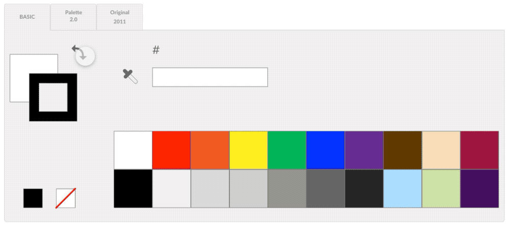
Main Color Swatch Palette
This palette is like most standard color palettes in graphic softwares and a requirement of the Map Design Team. I was to enhance the existing color palette tool and create new, helpful features.
Before the project, the design team was asked to list all the issues they had with the current palette.
These old issues were:
It was cumbersome to change the color of the stroke or solid - one had to double click on the element and then select a color.
The eyedropper was hidden inside the tool, so the user had to double-tap the main solid swatch to access it.
It was hard to tell which color or styled grey was in use or planned for selection (one had to memorize the order).
When drawing a shape, the solid & stroke colors auto-filled to something “random.”
The eyedropper was hidden inside the tool, so the user had to double-tap the main solid swatch to access it.
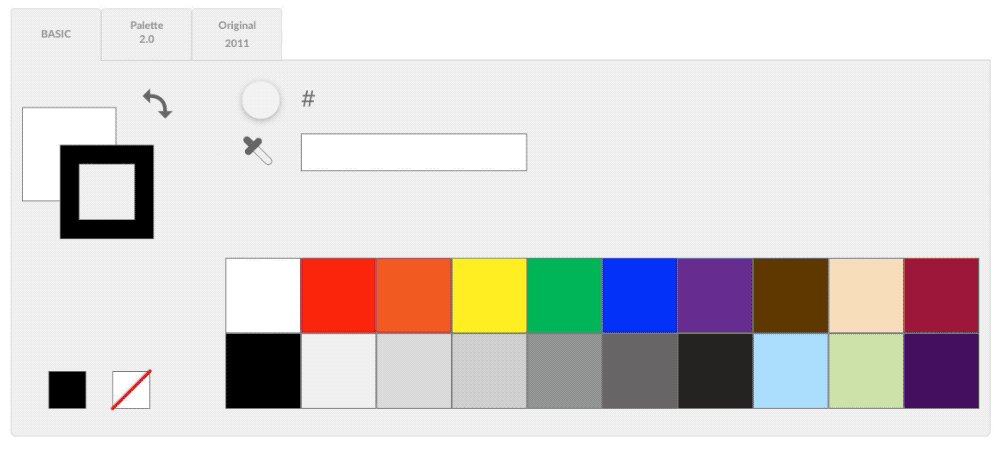
I listened to the users and addressed these issues with the following major improvements:
Adding switch arrows to toggle between the solid and stroke swatches.
Adding an eyedropper for the ability to sample treatments (solid & stroke colors and size).
Adding a text box for hex color for manual entries. The old way to enter a hex code was to double-tap the solid swatch for the color wheel pop-up window, where the color picker also lived.
Adding rollover info - when rolling over an item, and or, when the eyedropper hovers over a color, the hex number would appear next to the eyedropper icon area.

Old

New
NEW Color Palette
New Style Palette
With the Standard Visual Guideline undergoing a complete color change, I was tasked to create the new color palette tool incorporating the new set of styles. The original color set design was kept (third tab in the below video) in case the team needed to update old map projects for clients that were grandfathered in.
New palette highlights:
Add/ replace all the commonly used styles. For example, the stage color treatment was hex AFAFAF with no stroke, and the new treatment is hex 262626 with no stroke.
Add memory to tabs - Allow map designers to keep their workspace how they’ve left it.
Add rollover info - When hovering over a style, the info would appear above.
Original Style Palette
I gave the original palette a facelift even as it is being phased out to keep consistency.
Improvements were:
Add/ expand all the commonly used styles - the older version was very limiting as it only displayed 3 primary sets and there wasn’t a secondary set.
Add rollover info.
Keep memory of the tab in use.
Take Aways
The main “game-changer” features for the design team were on the color swatch palette (first tab). Time and clicks saved weren’t formally measured, but were felt by every designer.
It would have been nice to add a feature where the designers can drag around swatches and reorganize their workspaces to maximize workflow, but the development team said there wasn’t enough time to dedicate to this feature add. Perhaps round two we can revisit this.